Logo design and visual identity for a psychotherapist
The challenge client was very selective and I had to make several edits to the design and colours for the logo and visual brand.
The context and result create a pscyhotherapist’s brand to give the client a visual identity for their clients to recognize the entrepreneur’s platform of work.
Why I did this?
I made a logo along with the visual brand for the client because the client needed a logo for their clients to recognize they were a registered therapist who offered individual services.
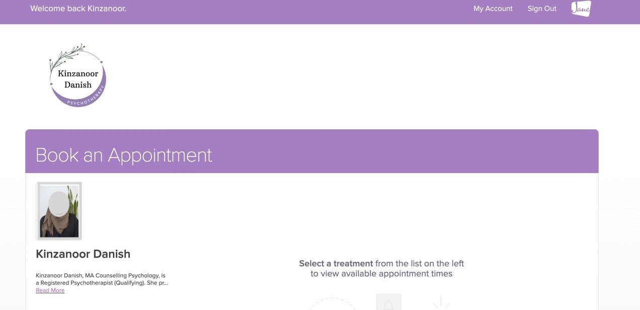
Psychotherapist’s Dashboard with Logo
Psychotherapist’s Dashboard with Logo

Psychotherapist’s Dashboard Header with Logo
Psychotherapist’s Dashboard Header with Logo
I found brand inspiration by questioning the client what therapy practices inspires their work. From the brand inspiration, I made the logo design and banners which includes the chosen colour palette.
I found brand inspiration by questioning the client what therapy practices inspires their work. From the brand inspiration, I made the logo design and banners which includes the chosen colour palette.
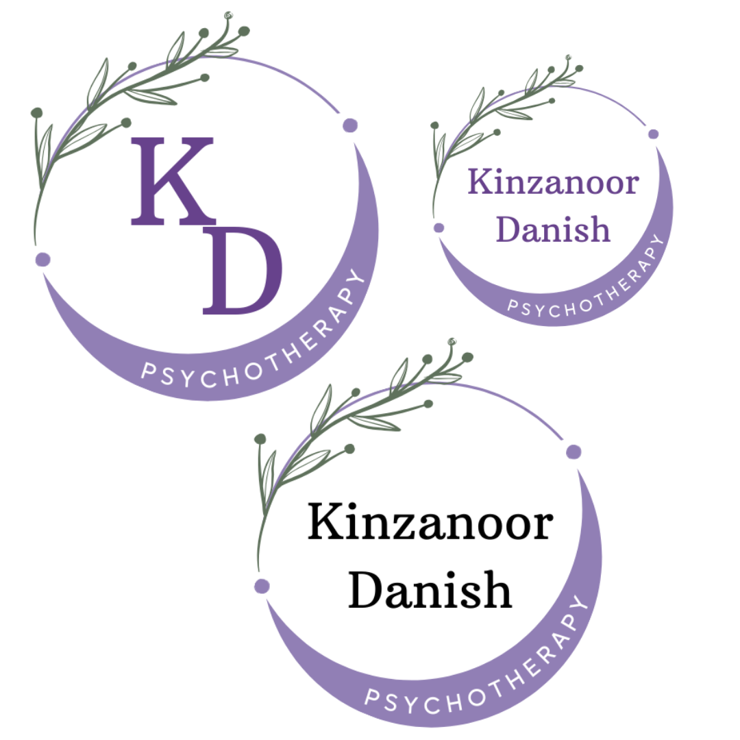
3 versions of logo for clients daily use
Logo design variations client chose from
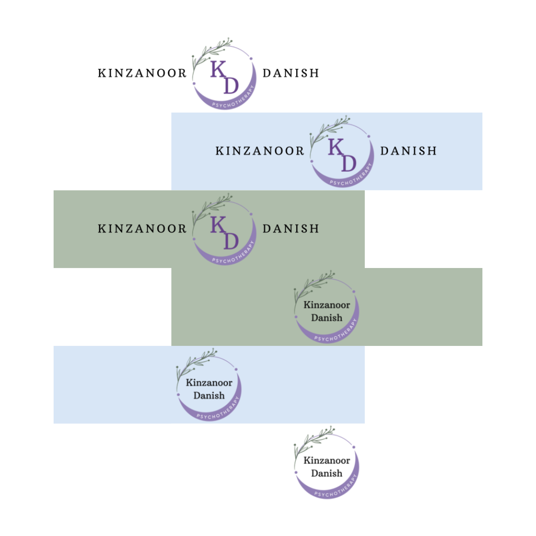
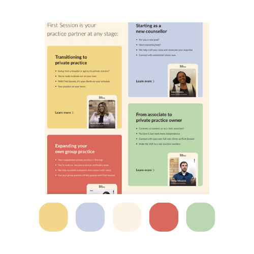
Final banners for client to market their psychotherapy practice
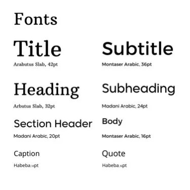
The clients work related inspirations for what they wanted for a logo and brand concept helped me pick out the font and colour palette for their therapy practice’s logo.
The clients work related inspirations for what they wanted for a logo and brand concept helped me pick out the font and colour palette for their therapy practice’s logo.
The visual board inspirations were taken from the clients work inspirations.
The visual board inspirations were taken from the clients work inspirations.
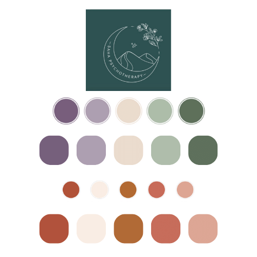
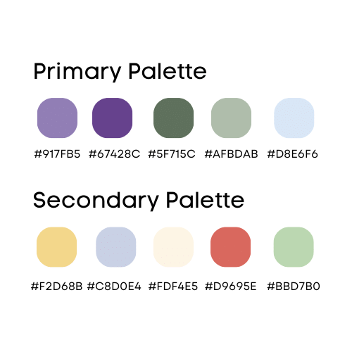
Colour palette inspiration from pyschotherapy
Colour inspiration from psychotherapists platform
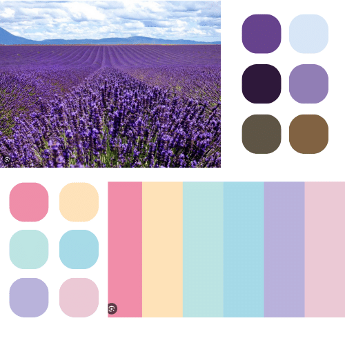
Inspiration from a few of client's favourite colours
Takeaways
What did and did not work?
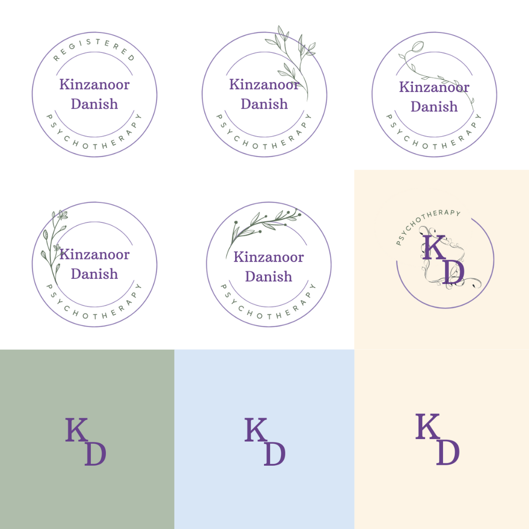
I made too many iterations of the logo and brand concept before meeting with the client. 3 logos and 1 brand concept was presented to the client to avoid confusion with making a variety of iterations for the clients visual identity.